Are your videos getting overlooked despite great content? Many creators unknowingly commit YouTube thumbnail mistakes that reduce click-through rates. The good news? Most of these errors are easy to fix. In this article, we highlight seven common YouTube thumbnail mistakes, explain why they hurt performance, and show you how to correct them for better impact and engagement. Let’s dive in and start optimizing!
Why Fixing YouTube Thumbnail Mistakes Matters
Thumbnails are your video’s first impression. A mistake here can discourage viewers before they’ve even watched. Correcting these issues can significantly enhance visibility, boost CTR, and drive more views—no marketing budget required.
1. Blurry or Low-Resolution Images
The Problem
Thumbnails with poor resolution appear pixelated on mobile and TV displays, making your video seem less professional.
The Fix
- ➡️ Always use 1280 × 720 pixels at PNG or high-quality JPG under 2MB.
- ➡️ Use design tools like Canva or Adobe Express.
📢 Tips: Want to compare with top creators? Visit thumbnailget.com to download HD thumbnails for inspiration.
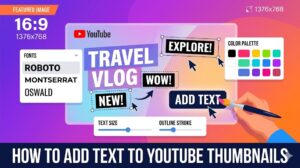
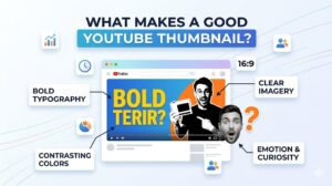
2. Too Much Text or Overcrowded Visuals
The Problem
Crowded thumbnails confuse viewers and reduce the effectiveness of your message.
The Fix
- ➡️ Stick to 2–4 bold words in a large, easy-to-read font.
- ➡️ Use bullet designs: key phrase + face + logo.
- ➡️ Whitespace matters—keep it clean and impactful.
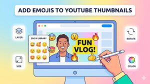
3. Ignoring Faces and Emotions
The Problem
Text-only thumbnails miss an emotional connection that captures attention.
The Fix
- ➡️ Include a close-up of an expressive face.
- ➡️ Zoom in to fill 30–50% of the frame.
- ➡️ Use subtle overlays to increase facial contrast.
4. Weak Contrast or Color Blending
The Problem
Thumbnails that blend into YouTube’s white background get lost in the feed.
The Fix
- ➡️ Opt for vibrant, high-contrast colors like yellow, red, or green.
- ➡️ Pair light text on dark backgrounds—or vice versa—for readability.
- ➡️ Test visibility in both light and dark mode.
5. Unreflective Branding Elements
The Problem
Overlooking consistent branding confuses subscribers and misses recognition opportunities.
The Fix
- ➡️ Use a small, unobtrusive logo or color strip.
- ➡️ Stick to a consistent font and color palette.
- ➡️ Check out successful examples on thumbnailget.com.
6. Misleading or Clickbait Thumbnails
The Problem
Misleading thumbnails lead to high bounce rates, hurting your watch time and channel reputation.
The Fix
- ➡️ Ensure your thumbnail accurately reflects your content.
- ➡️ Quality over clickbait—viewers appreciate honesty.
- ➡️ Monitor analytics to spot spikes in bounce or early exits.
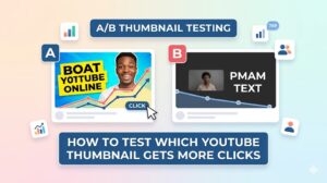
7. Ignoring Thumbnail Testing
The Problem
Assuming your first design is the best can lead to subpar performance.
The Fix
- ➡️ Review your video’s CTR and retention stats.
- ➡️ Use variations: try different colors, text placements, or facial expressions.
- ➡️ YouTube allows thumbnail changes even after publishing—take advantage of it!
CTA: Boost Thumbnails with thumbnailget.com
Before designing a new thumbnail, research what’s working. Use thumbnailget.com to download HD thumbnails from top-performing videos, analyze their layout, style, and color choices—and apply what works to your own design.
Final Thoughts
Avoiding these YouTube thumbnail mistakes can dramatically improve your video’s performance. By focusing on resolution, clarity, emotional resonance, and honest branding, you give each video its best chance to shine. Make these adjustments, monitor your analytics, and keep iterating. With better thumbnails, you’ll grow views, engagement, and subscribers—all without spending extra on ads.
FREQUENTLY ASKED QUESTIONS (FAQS)
How important is thumbnail quality?
High-resolution thumbnails are essential—they prevent images from appearing fuzzy and help maintain a professional appearance.
Should every thumbnail include faces?
While not mandatory, faces with emotion significantly boost clicks due to their emotional draw.
What is ideal text length on thumbnails?
2–4 words is best—short, sharp, and expressive.
How do I test thumbnail performance?
Monitor CTR and watch time in YouTube Analytics. If click rates or retention lag, try swapping thumbnails.
Are custom thumbnails necessary?
Yes—custom thumbnails outperform auto-generated ones and give you full control over the visual hook.
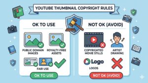
Is using thumbnailget.com legal?
Absolutely. It’s a free, public resource for downloading thumbnails legally for inspiration and analysis only.