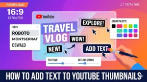
Choosing the best colors for YouTube thumbnails can dramatically improve click-through rates, viewer attention, and overall video performance. Color is one of the first things viewers notice when scrolling through YouTube feeds, and the right color combinations can make your content stand out instantly.
Understanding the best colors for YouTube thumbnails involves more than simply choosing bright shades. Successful creators use strategic color combinations, emotional triggers, and strong contrast to create visually powerful thumbnails. In this guide, you will learn how color psychology YouTube thumbnails affects viewer behavior, which palettes work best for different niches, and proven YouTube thumbnail tips that help videos attract more clicks.
Why the Best Colors for YouTube Thumbnails Matter
Colors Influence Viewer Attention
One reason the best colors for YouTube thumbnails are so important is because YouTube is highly competitive. Thousands of videos compete for viewer attention at the same time, especially on homepages and search results.
Strong colors help:
- Improve thumbnail visibility
- Create emotional reactions
- Increase click-through rates
- Highlight important text
- Strengthen branding
Without proper color contrast, thumbnails can easily disappear into crowded feeds.
Colors Affect Emotional Response
An important part of color psychology YouTube thumbnails is understanding how different colors influence emotions and viewer behavior.
Examples include:
- Red → urgency and excitement
- Yellow → energy and positivity
- Blue → trust and calmness
- Green → growth and money
- Black → power and drama
Successful creators combine these emotional associations with effective thumbnail messaging.
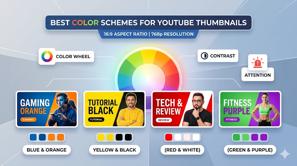
Best Colors for YouTube Thumbnails That Increase CTR
Yellow and Black
One of the most effective combinations among the best colors for YouTube thumbnails is yellow and black. This combination creates extremely strong contrast and remains visible even on small mobile screens.
Benefits include:
- High readability
- Strong visibility
- Bold emotional impact
- Excellent text clarity
Many gaming, tech, and reaction channels use this color combination successfully.
Red and White
Red and white is another classic combination used in many successful YouTube thumbnail design strategies.
This combination works well because:
- Red attracts immediate attention
- White text remains readable
- The design feels energetic
- It complements YouTube’s branding
Tip: Use red carefully because too much red can overwhelm the thumbnail and reduce visual balance.
Blue and Orange
Blue and orange are complementary colors that create strong visual contrast naturally. Many creators use this pairing because it feels balanced while still helping thumbnails stand out.
This combination works especially well for:
- Educational channels
- Technology videos
- Business content
- Travel content
Green and Black
Green is commonly associated with money, growth, success, and positivity. Combined with black backgrounds, green becomes highly visible and impactful.
Creators often use green for:
- Finance channels
- Gaming content
- Crypto videos
- Tutorial videos
Color Psychology YouTube Thumbnails Creators Use
Using Warm Colors for Energy
Warm colors such as red, orange, and yellow create excitement and urgency. Many creators who study color psychology YouTube thumbnails use warm colors to increase emotional intensity.
Warm colors work well for:
- Reaction videos
- Challenge content
- Trending news
- Entertainment videos
Using Cool Colors for Trust
Cool colors such as blue and purple often create feelings of trust, professionalism, and calmness.
These colors are commonly used in:
- Educational videos
- Business channels
- Technology tutorials
- Product reviews
Combining Emotional Triggers
Many advanced creators combine emotional triggers strategically. For example:
- Red + yellow → urgency and excitement
- Blue + white → professionalism and clarity
- Black + gold → luxury and authority
Understanding emotional associations helps improve thumbnail performance significantly.
YouTube Thumbnail Tips for Better Color Usage
Use Strong Contrast
One of the most important YouTube thumbnail tips is using high contrast between text, backgrounds, and subjects.
Strong contrast helps:
- Improve readability
- Increase mobile visibility
- Highlight focal points
- Create visual separation
Many of the best colors for YouTube thumbnails work specifically because they create strong contrast naturally.
Limit the Number of Colors
Using too many colors can make thumbnails appear cluttered and confusing.
Professional thumbnails often use:
- One dominant color
- One secondary color
- One accent color
Special Attention: Simpler color palettes usually create cleaner and more professional-looking thumbnails.
Match Colors to Your Brand
Consistent branding helps viewers recognize your videos instantly.
Many successful channels consistently use:
- The same background colors
- Similar text styles
- Recognizable color schemes
- Consistent accent colors
Brand consistency improves long-term audience recognition.
How to Make Stand Out YouTube Thumbnails
Use Bright Accent Colors
Bright accents help create stand out YouTube thumbnails by directing viewer attention toward important elements.
Accent colors can highlight:
- Text
- Arrows
- Facial expressions
- Important objects
- Clickable elements
Darken Backgrounds for Better Focus
Many creators use darker backgrounds because they help bright text and subjects stand out more clearly.
Darkened backgrounds improve:
- Text readability
- Visual hierarchy
- Subject separation
- Overall thumbnail clarity
Use Color to Guide Attention
Color can direct viewers toward specific thumbnail elements naturally. Bright colors usually attract attention first, making them ideal for focal points.
Studying Successful Thumbnail Colors With ThumbnailGet.com
Analyze Trending Thumbnail Styles
One of the fastest ways to learn the best colors for YouTube thumbnails is by analyzing successful creators in your niche.
Many creators use
:contentReference[oaicite:0]{index=0}
to download and study trending thumbnails for inspiration and research.
Using
:contentReference[oaicite:1]{index=1},
you can:
- Study color combinations
- Analyze visual contrast
- Observe niche-specific trends
- Compare thumbnail styles
- Improve your own design strategy
Tip: Save high-performing thumbnails from your niche and identify recurring color patterns among top creators.
Common Color Mistakes in YouTube Thumbnail Design
Using Low Contrast
Low contrast makes thumbnails difficult to read and weakens visibility in crowded YouTube feeds.
Overusing Neon Colors
Excessive neon colors can make thumbnails look chaotic or visually overwhelming.
Ignoring Mobile Readability
Many creators forget that thumbnails appear much smaller on smartphones.
Always preview thumbnails at smaller sizes before uploading.
Using Too Many Color Variations
Too many competing colors reduce visual clarity and confuse viewers.
Warning: Focus on clean color hierarchy instead of using every bright color available.
Advanced Strategies for Best Colors for YouTube Thumbnails
Use Color Consistency Across Series
Many successful channels use recurring color themes for specific content categories.
For example:
- Red thumbnails for reactions
- Blue thumbnails for tutorials
- Green thumbnails for finance videos
This helps audiences identify content types instantly.
Test Different Color Combinations
Thumbnail testing helps identify which colors generate the highest click-through rates for your audience.
Combine Colors With Emotional Text
The strongest thumbnails combine emotional text with strategic color psychology to maximize viewer attention.
Final Thoughts on Best Colors for YouTube Thumbnails
Understanding the best colors for YouTube thumbnails can significantly improve click-through rates, audience engagement, and overall channel growth. Strong color combinations help videos stand out while supporting emotional storytelling and branding.
By applying proven YouTube thumbnail tips, understanding color psychology YouTube thumbnails, and focusing on clean YouTube thumbnail design, creators can build more effective and visually powerful thumbnails.
To study trending thumbnail color strategies and improve your creative inspiration, visit
:contentReference[oaicite:2]{index=2}
and explore successful YouTube thumbnails from popular creators.