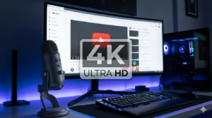
Your thumbnail text can decide whether viewers click or keep scrolling. Choosing the best fonts for youtube thumbnails helps your videos look bold, clear, and professional in crowded search results. In this guide, you’ll discover free and paid font options, smart styling tips, and practical advice to improve click-through rates. If you want stronger branding and better visibility, picking the best fonts for youtube thumbnails is one of the easiest upgrades you can make.
Why the Best Fonts for YouTube Thumbnails Matter
The best fonts for youtube thumbnails do more than look attractive. They help viewers read your title quickly on mobile screens, understand the topic instantly, and remember your channel style. Great fonts can make thumbnails feel trustworthy, exciting, funny, or urgent depending on your niche.
When selecting the best fonts for youtube thumbnails, focus on readability first, style second. Fancy fonts may look good close-up, but clear bold fonts usually win when thumbnails appear small.
Tip: Test your thumbnail at a small size before publishing. If the text is hard to read, choose stronger best fonts for youtube thumbnails options.
Top Free Fonts YouTube Thumbnails Creators Love
If you are on a budget, there are many excellent free fonts youtube thumbnails creators can use for standout designs. These fonts are popular because they remain readable and eye-catching.
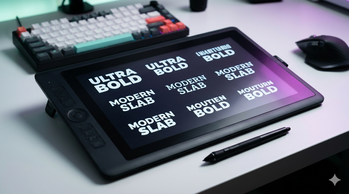
1. Bebas Neue
A clean all-caps font that works well for gaming, tutorials, and reaction content. Many creators consider it among the best fonts for youtube thumbnails because it looks bold without clutter.
2. Anton
Heavy and powerful, Anton is excellent for dramatic headlines and challenge videos.
3. Oswald
Modern and narrow, making it ideal when you need more words in limited space.
4. Impact
A classic choice for strong emphasis and meme-style designs.
5. League Spartan
Sharp, modern, and clean for business or tech channels.
These free fonts youtube thumbnails choices can compete with premium fonts when used properly.
Best Google Fonts YouTube Thumbnails Options
If you want easy access and web-safe licensing, google fonts youtube thumbnails users can install quickly are a smart choice.
1. Montserrat ExtraBold
Stylish and highly readable. Great for lifestyle, vlogs, and educational content.
2. Poppins Bold
Rounded and modern with strong visual balance.
3. Bangers
Comic-inspired and energetic for entertainment channels.
4. Rubik Black
Chunky and modern for thumbnails that need impact.
5. Archivo Black
Strong lines and excellent readability at smaller sizes.
Many creators searching for the best fonts for youtube thumbnails start with Google Fonts because they are free, trusted, and easy to use.
Best Paid Fonts for YouTube Thumbnails
Premium fonts can help channels build a unique brand identity. If you want something less common, paid fonts may be worth the investment.
1. Proxima Nova
Professional, clean, and versatile for almost any niche.
2. Gotham
Bold and premium-looking with strong readability.
3. Avenir Next
Sleek and modern for polished brand channels.
4. Nexa Bold
Excellent for minimalist and tech-inspired designs.
5. Futura PT
Classic geometry and powerful headline presence.
For creators serious about branding, these can become the best fonts for youtube thumbnails because fewer competitors use them.
YouTube Thumbnail Text Tips for Better Clicks
Choosing the best fonts for youtube thumbnails is only part of success. Text placement and wording matter too.
Keep Text Short
Use 2 to 5 words when possible. Long text shrinks readability.
Use Contrast
White text on dark backgrounds or dark text on bright areas improves visibility.
Add Stroke or Shadow
Outlines and shadows help text stand out from busy backgrounds.
Highlight Key Words
Use a second color for emotional or important words.
Stay Consistent
Use the same font family regularly to build recognition.
Special Attention: Even the best fonts for youtube thumbnails fail if text blends into the image. Contrast is essential.
YouTube Thumbnail Design Mistakes to Avoid
Strong youtube thumbnail design depends on clarity. Avoid these common problems:
Using Thin Fonts
Thin letters disappear on mobile screens.
Too Many Fonts
Using three or four styles creates clutter. Stick to one or two.
Overcrowded Text
Too many words reduce click potential.
Poor Spacing
Letters packed too tightly are harder to read.
Ignoring Branding
Random font changes weaken channel identity.
Fixing these mistakes helps you get more value from the best fonts for youtube thumbnails.
How to Test the Best Fonts for YouTube Thumbnails
Create Two Versions
Use different fonts on similar thumbnails and compare click-through rate.
Check on Mobile
Most viewers use mobile devices, so preview there first.
Review Competitors
Study leaders in your niche, then create a clearer and stronger version.
Download Examples for Analysis
Want to study successful thumbnails closely? Use thumbnailget.com to quickly save public thumbnails and compare layouts, text size, and font styles for inspiration.
Tip: Researching competitors can reveal which best fonts for youtube thumbnails styles already attract clicks in your niche.
Best Font Pairings for YouTube Thumbnails
Anton + Montserrat
Strong headline with clean subtext.
Bebas Neue + Poppins
Energetic title with modern support text.
Impact + Oswald
Bold urgency with narrow balance.
League Spartan + Rubik
Modern and sleek combo.
Combining fonts strategically can create even better best fonts for youtube thumbnails results.
Conclusion
The best fonts for youtube thumbnails are the ones that stay readable, match your brand, and attract clicks instantly. Free options like Bebas Neue, Anton, and Montserrat are excellent starting points, while premium fonts can help channels stand out further. Combine smart typography with strong contrast and clean layouts for the best results. If you want to study winning examples and improve your own designs, explore thumbnails easily with thumbnailget.com. Mastering the best fonts for youtube thumbnails can transform your channel’s first impression.